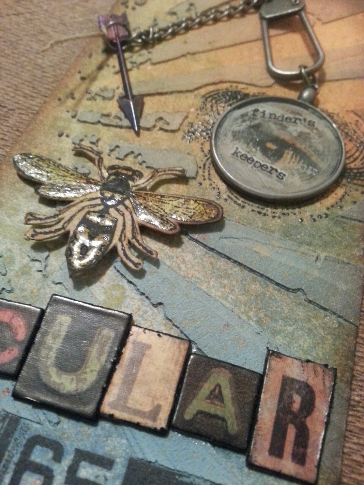
So this week I tried something new and COMBINED challenges I found on the net (whoooaaa adventurous). So what were the challenges you ask?
Well the first was the Tim Holtz 12 Tags of 2014 challenge:
For this challenge, he basically walks you through how he made a cool tag (see the image, it's pretty cool) and shows you some really cool techniques, then you take the techniques and make them into your own creation. The highlights here are the hardware (monocle, ribbon, stamp things), texture paste (that I made with acrylic paint, glue, and baby powder!), distress stain spray (I just used diluted reinkers...), and then some other of the usual distressing and "aging" things.
The other challenge is from Simon Says Stamp Blog where it was basically just a theme to adhere to. The theme for this challenge was "O" is for... so I scoured my room for what I had that related to the letter O, and found... nothing. But I thought I had a stencil with a eye chart, but I didn't. However, I was already committed to the idea of Optometry so I made it work. Here is my finished project!


Such a great idea for our o-challenge and a stunning take on Tim's tag. Thank you so much for sharing with us at Simon Says Stamp Monday Challenge Blog!!
ReplyDeleteThanks for the kind words Anna-Karin! It was a lot of fun. I'm excited to try my hand at some other challenges :)
DeleteI like this! A perfect example of how improvisation makes for the best (and decidedly original) art work. I look forward to seeing future projects.
ReplyDeleteI think my favorite part was making my own texture paste. That stuff works great and adds some cool dimension to my projects.
DeleteVery cool tag Steve! I love the monocle over the eye. Congratulations on your win! Karen.x
ReplyDeleteThanks Karen! I have to admit, I was feeling really clever with that one. Luckily the theme worked with the small stamp collection I have haha
DeleteCool tag! Congratulations on your win!
ReplyDeleteCongrats on your win over at Tim's place. This is indeed a brilliant adaptation of his tag.
ReplyDeleteCongratulations on your win at Tim's tag of the month.
ReplyDeleteThanks! I'm super excited! It's my first in for something artsy.
DeleteLove your tag! So cool!
ReplyDeleteCongrats on being featured at Tim's blog!
Thank you!
DeleteWow, such a great job. Love your take on the tag.
ReplyDeleteThanks Judy! I really liked the tiny pumpkin on yours.
DeleteWhat a cool word and a cool take! Congrats on the win!!!
ReplyDeleteThanks! "Optometry" was too long to fit on the tag ;)
DeleteAaah this is AWESOME ! Congrats !
ReplyDeleteThanks for the support!
DeleteWhat a fabulous tag Steve!! I love your color palette and stamped eye in the rays. Great letters too. Wonderful make! Congrats on your win on Tim's blog.
ReplyDeleteThanks! The eye did turn out pretty great (despite using an old receipt cut up and taped down with some painters tape for a "mask" haha).
DeleteYour tag is great and so original!! I really like the subtle muted coloring and the way you incorporated the different elements. Congrats - well deserved!! Cathy
ReplyDeleteToo kind, thanks!
Delete